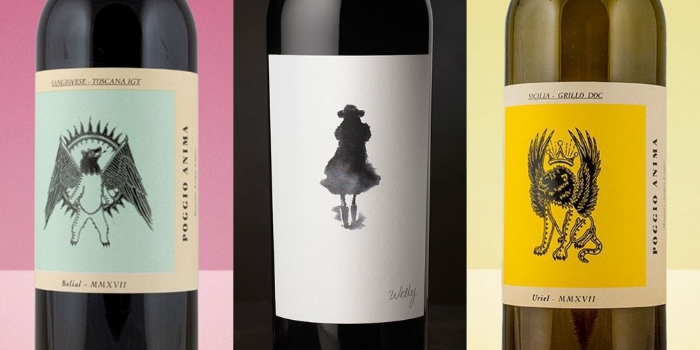
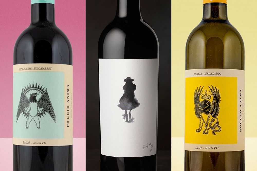

The wine's label is spare—almost coy. An elegant black blotch of a figure floats on a field of ivory. The wine's name, "Welly," is tucked down in a corner. There is no other text, no vintage or varietal or appellation, on the front of the bottle. The label is less like a billboard and more like a wink, an appeal to your right brain rather than your left.
For a wine with Welly's price tag and pedigree—a $175 Cabernet Sauvignon from Lail Vineyards, one of the Napa Valley's most esteemed producers—everything about the label is unorthodox. And yet it also feels part of this particular moment's zeitgeist.
READ MORE: The 2021 Wine Lover's Guide
"We're definitely seeing a trend toward very artistic, hand-drawn, minimalistic expressions on labels—almost like little fine-art pieces," says David Schuemann, owner and creative principal at CF Napa Brand Design.
Schuemann literally wrote the book on wine-label design, and his firm has helped oversee recent label makeovers for Heitz Cellar, Groth, and other high-end Napa producers. Even 10 years ago, he says that a heavyweight like Lail probably wouldn't have considered a label that didn't broadcast its bona fides. But times change, and winemakers are adapting to a new generation of consumers with new tastes—and active Instagram accounts.

"The wine market is now a Millennial-driven market, and there's been a movement toward more modernity and the kind of avant-garde visual cues you associate with U.S. wines, and not so much with European wines," he says.
The use of photography—in both mixed-media designs and on their own, color or black-and-white—is increasingly popular on wine labels. So too is unorthodox or even unsettling imagery.
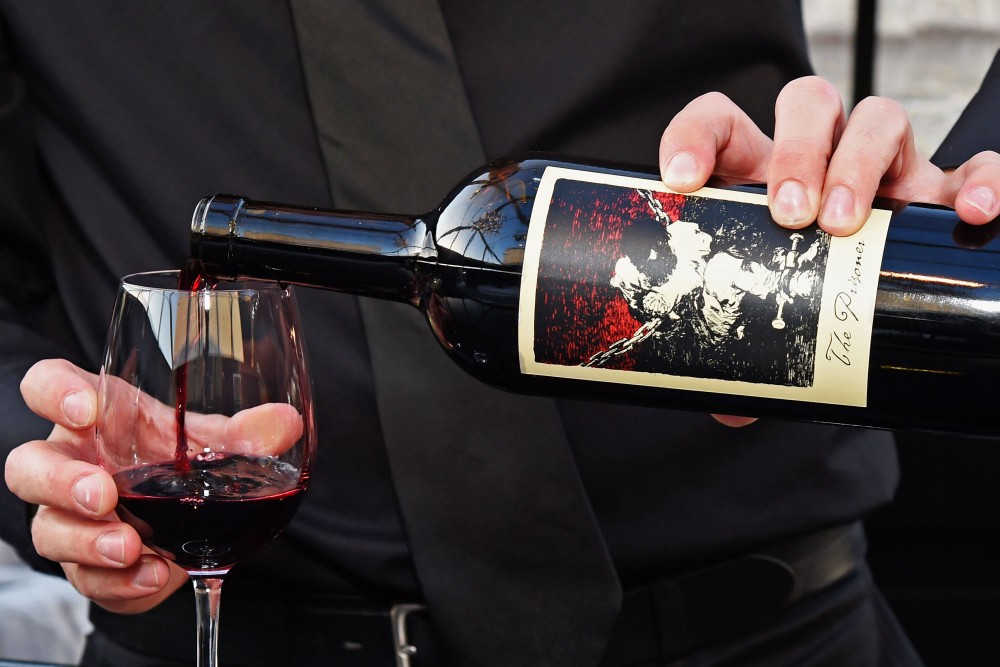
It's impossible to talk about trends in wine labels without mentioning The Prisoner, one of the most commercially successful and aesthetically unconventional wines of the last 20 years. The brainchild of winemaker Dave Phinney, The Prisoner's label features a Goya etching of a man bound in chains.
READ MORE: 12 Wines That Serious Collectors Don't Want You to Know About
"I think there was a kind of unwritten rule that the [producer's] name had to be on the label, and you would never use any kind of controversial imagery," says Jeremy Otis, design director at Force & Form, a brand design studio in San Francisco. "Dave Phinney broke those rules with The Prisoner, and it worked, and now you walk into Safeway or Kroger and see a lot of labels that you never would have seen 15 years ago."
Otis points out that, apart from The Prisoner's provocative label art, nearly all of that wine's information has been relegated to its back label. "That builds mystery and gets people to pick up the wine and roll it around to learn more," he says.
Once a shopper does that, the battle is nearly won. "I know this sounds a little creepy, but I've stood in wine shops and grocery stores and watched how people pick wines," Schuemann says. "I can tell you that once a consumer picks up a wine and looks at it, there's probably an 80% chance they'll put it in their basket."
When people handle wine, they're not just reading the back label. The texture, cut, and other elements of the bottle's packaging also matter. "A lot of consumers rub their fingers over a wine's label, and if it feels rich and well-crafted, that gives them the sense that the wine will be as well," Schuemann says. Especially when it comes to higher-end wines, he says that many labels today combine clean, simple graphics with embossing, die cuts, or other textural elements that give the label a premium feel.
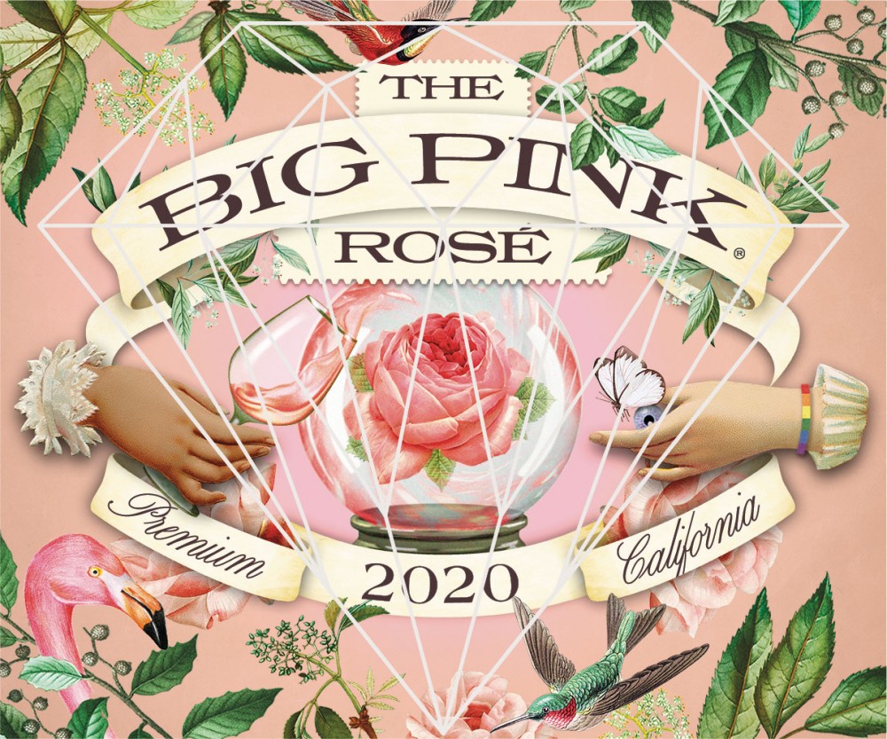
While the popularity of brooding or unorthodox label art shows no signs of abating, there's a coincident movement toward splashy color and whimsical imagery—something that was more prevalent 20 years ago, but that for a time went out of fashion.
"We had the critter craze and all these colorful labels—the whole Yellow Tail phenomenon," Schuemann says. "That faded for a while, but now we're seeing a move back toward brighter labels and injections of color, even for more expensive wines."
Some wine labels meld several of these trends—combining blocks of bright color with counterculture artwork.
Poggio Anima, a new series from Italian winemaker Riccardo Campinoti and importer Ronnie Sanders, features what its proprietors term "pagan" imagery. "The label images were done by a tattoo artist that I grew up with," says Sanders, president of Vine Street Imports. While the reds in the series feature winged bears and other "fallen angels," the whites feature arch angels. "We liked the idea of good vs. evil, red vs. white," he says.
Small, independent producers—including many European and natural winemakers—have helped lead and popularize many of these design movements, from the use of art and photography to unconventional printing techniques. "A wine's brand and label has to communicate its makers' beliefs and values, and a sense of the experience a consumer will have," says Alex Chrisman, owner and creative director at Alta, a Sonoma-based design studio. "With natural wines, you see this wet-ink look, and also a lot of very raw, rough elements."
Another burgeoning trend from the natural-wine scene is the abandonment of bottle capsules, which are the stiff foil tops that traditionally cover the wine's cork. "It was shocking 10 years ago to release a wine without a capsule or foil, but now it's common among small producers—it makes a wine look more underground," says Form & Function's Otis.
He says there are many other "micro-categories," or trends within trends, that mirror the ongoing diversification and segmentation of the wine market. But current movements in label design are also about winemakers trying to communicate what they do and what they're all about. "First and foremost, a label's job is to create differentiation—to pop out on the shelf—but it also has to be a reflection of the brand's story," he says.
"A lot of wines come from smaller producers, and these are highly personal to them," he adds. "This is someone's dream that they've been working on for years, and the label needs to respect and communicate that."